- Published on
Interactive SA2 and SA4 Statistical Areas Map of Australia - Now Live in Data Hub
- Authors
- Name
Quick Access: Interactive SA2 and SA4 maps now available in OzSparkHub's Data Hub - explore Australia's statistical geography with unprecedented detail and ease.
Your Requests Have Been Heard
Since publishing my analysis on converting SA2 codes to Employment Regions, I've received numerous inquiries from data analysts, policy makers, and employment service providers asking for better ways to visualize and understand Australia's statistical area boundaries. The most common questions have been:
- "How can I quickly identify which SA2 my service area belongs to?"
- "Where can I find an interactive map that shows both SA2 and SA4 boundaries?"
- "Is there a tool that lets me zoom down to street level to see exact boundaries?"
- "Can I get a visualization that works on mobile devices?"
Well, I'm excited to announce that I've created exactly what you've been asking for!
Introducing the Interactive Statistical Areas Map
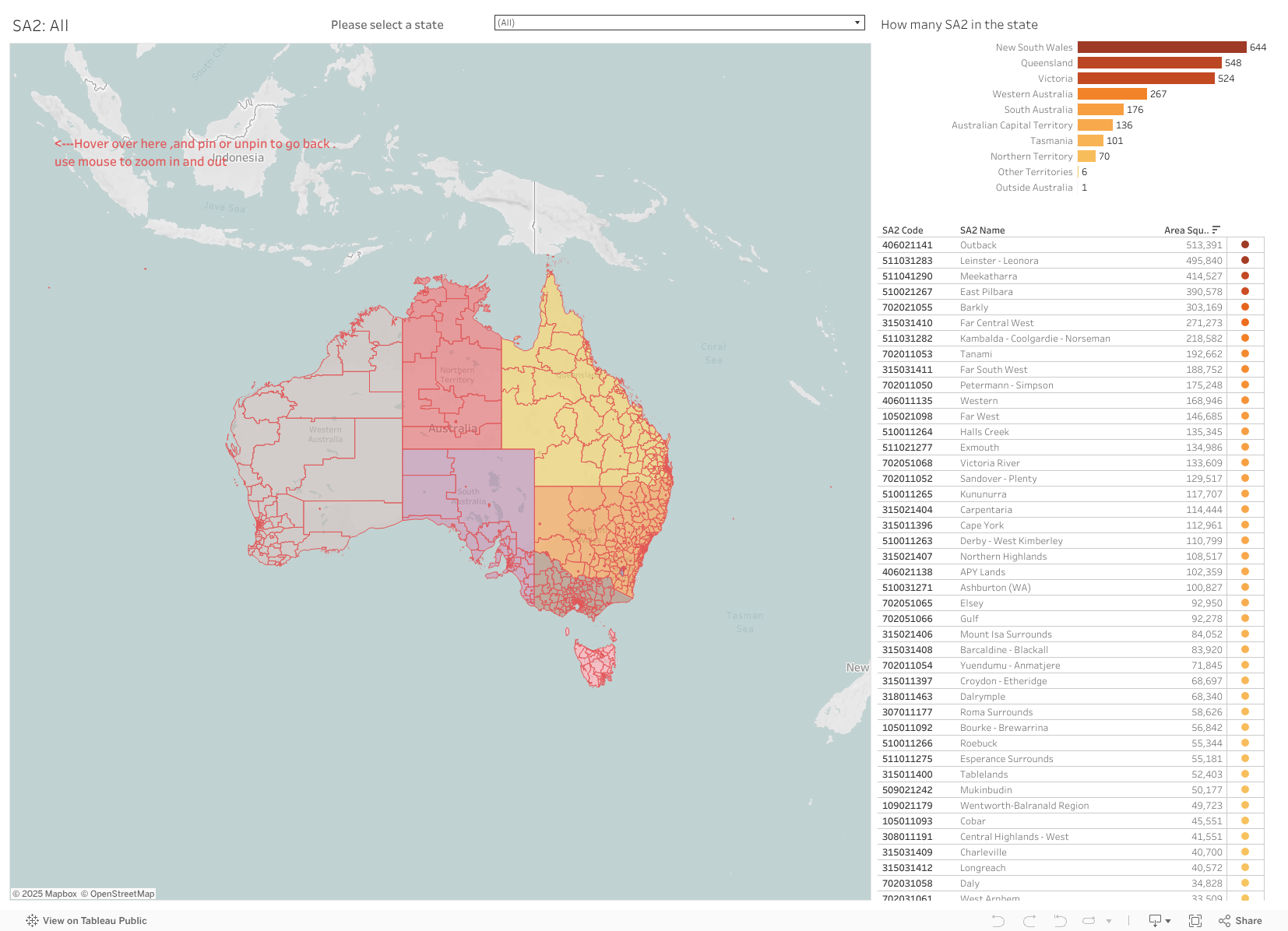
I've developed a Tableau visualization that brings Australia's statistical geography to life. This isn't just another static map - it's a fully interactive tool that allows you to explore, analyze, and understand the relationship between SA2 (Statistical Area Level 2) and SA4 (Statistical Area Level 4) regions across the entire country.
What Makes This Map Special?
1. Dual-Layer Visualization Navigate seamlessly between SA2 and SA4 views. Whether you need the granular detail of SA2 boundaries for local analysis or the broader perspective of SA4 regions for strategic planning, both layers are instantly accessible.
2. Street-Level Precision Zoom in to see exact boundary lines at street level. This is particularly valuable when you need to determine which statistical area a specific address or facility belongs to - no more guessing or approximating.
3. Interactive Features That Actually Work
- Hover for Details: Simply move your cursor over any area to see its name, code, and key statistics
- Pin/Unpin Function: Found an area you want to reference? Pin it to keep its information visible while exploring other regions
- Smart Selection Tools: Use the selection button in the upper left corner to highlight multiple areas for comparison
- Smooth Zoom Controls: Use your mouse wheel or trackpad to zoom in and out smoothly - from national view down to neighborhood level
How to Use the Interactive Map
Getting started is incredibly simple:
Access the Map: The visualization is embedded below and also permanently available in our Data Hub under "GSS Map"
Navigate Like a Pro:
- Zoom: Scroll with your mouse wheel or pinch on mobile devices
- Pan: Click and drag to move around the map
- Select: Click the selection tool (upper left) to highlight specific areas
- Pin Information: Click the pin icon when hovering over an area to keep its details visible
Switch Between Views:
- Toggle between SA2 and SA4 views using the dashboard tabs
- Each view maintains your zoom level and position for easy comparison
The Live Interactive Dashboard
👉 Open Full-Screen Interactive Map
Why Statistical Areas Matter for Employment Services
Understanding SA2 and SA4 boundaries is crucial for:
Employment Service Providers
- Service Area Planning: Identify exactly which SA2s fall within your contracted service areas
- Performance Reporting: Align your outcomes data with ABS employment statistics
- Market Analysis: Understand the demographic and economic characteristics of your service regions
Policy Makers and Researchers
- Resource Allocation: Make data-driven decisions about where to focus employment programs
- Trend Analysis: Track employment outcomes across consistent geographic boundaries
- Cross-Regional Comparison: Compare performance and outcomes across different SA4 regions
Data Analysts and Tender Teams
- Geographic Matching: Quickly convert between postcodes, SA2s, and employment regions
- Tender Preparation: Accurately identify service areas for tender submissions (like the recent IEA tender winning providers analysis)
- Data Integration: Merge ABS statistics with your operational data using consistent boundaries
Technical Details for Power Users
For those interested in the technical aspects:
- Data Source: ABS Statistical Area boundaries (2021 edition, GDA2020 projection)
- Update Frequency: Aligned with ABS boundary updates (typically every 5 years)
- Coverage: Complete coverage of all Australian SA2s (2,310 areas) and SA4s (88 areas)
- Precision: Boundaries accurate to street level in urban areas
- Performance: Optimized for smooth interaction even with detailed boundaries
What's Next?
This interactive map is just the beginning. Based on your feedback, I'm planning to add:
- Demographic Overlays: Population, unemployment rates, and industry composition
- Employment Region Boundaries: Overlay current Workforce Australia employment regions
- Search Functionality: Find areas by name, postcode, or SA code
- Data Export: Download boundary data for your selected areas
- Mobile App: Native mobile application for field workers
Your Feedback Matters
I've built this tool based on your requests and feedback. If you have suggestions for improvements or additional features you'd like to see, please don't hesitate to reach out. Every piece of feedback helps make these tools more useful for the entire employment services community.
Access and Availability
The interactive SA2 and SA4 Statistical Areas Map is now permanently available in:
- OzSparkHub Data Hub: Navigate to Data Grove > GSS Map
- Direct Link: Bookmark the Tableau Public dashboard for quick access
- Mobile Access: Fully responsive design works on all devices
Related Resources
For more insights on working with Australian statistical geography:
- Converting SA2 codes to Employment Regions
- Understanding Unemployment Rates by Employment Region
- Extracting Data from JSA PDF Dashboards
Conclusion
The launch of this interactive SA2 and SA4 map represents a significant step forward in making Australian statistical geography more accessible and usable for everyone in the employment services sector. Whether you're preparing a tender, analyzing service delivery patterns, or simply trying to understand your local area better, this tool puts powerful geographic insights at your fingertips.
Remember, understanding your geography is the first step to understanding your market. With this new interactive map, that understanding is now just a click away.
Technical Note: This visualization uses the official ABS SA2 and SA4 boundaries from the 2021 Australian Statistical Geography Standard (ASGS), projected in GDA2020. For the most current employment region boundaries and updates, always verify with the Department of Employment and Workplace Relations.
Data Privacy: This map displays only publicly available boundary information from the Australian Bureau of Statistics. No personal or sensitive data is included in the visualization.